¿Qué pasa cuando hay 2 clases col de BOOTSTRAP?
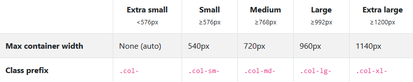
El .col es para 576px hacia ABAJO y el
col-md-8 es de tablet hacia ARRIBA
Ejemplo 1
col-md-8: 8/12 de tablet HACIA ARRIBA, phone: 12/12
col-6 col-md-4: 4/12 de tablet HACIA ARRIBA, phone: 1/2
Ejemplo 2
col-lg-8: 8/12 de DESKTOP HACIA ARRIBA, PHONE & TABLET: 12/12
col-6 col-lg-4: 4/12 de DESKTOP HACIA ARRIBA, PHONE & TABLET: 1/2
Ejemplo 3
col-md-12: que en todos los tamaños utilice las 12 columnas
Ejemplo 4
col-sm-4: que en todos los tamaños utilice las 4 columnas pero en extra pequeño sea de 12
Margins
Margin-top: mt-1 mt-2 mt-3 mt-4 mt-5
Margin-bottom: mb-1 mb-2 mb-3 mb-4 mb-5
Margin-top: mt-1 mt-2 mt-3 mt-4 mt-5
Margin-top: mt-1 mt-2 mt-3 mt-4 mt-5
Paddings
Padding-top: pt-1 pt-2 pt-3 pt-4 pt-5
Padding-bottom: pb-1 pb-2 pb-3 pb-4 pb-5
Padding-top: pt-1 pt-2 pt-3 pt-4 pt-5
Padding-top: pt-1 pt-2 pt-3 pt-4 pt-5
Centrar elemento
mx-auto y text-center
- Etiquetas html:
<section> - Formulas con etiqueta
<var>(una etiquetavarpor cada letra): y = mx + b - Tachado
<s>:This line of text is meant to be treated as no longer accurate. - Subrayado
<u>:This line of text will render as underlined - Letra pequeña
<small>This line of text is meant to be treated as fine print. -
This text is muted
class="text-muted" -
This text is important.
class="text-primary" -
This text indicates success.
class="text-success" -
This text represents some information.
class="text-info" -
This text represents a warning.
class="text-warning" -
This text represents danger.
class="text-danger" -
Secondary text.
class="text-secondary" -
This text is dark grey.
class="text-dark" - También hay text-white
- La etiqueta
<cite>sirve para citar - blockquote-footer:
<blockquote-footer>
container
.row
col , equal-width columns on small, medium, large, and extra large devices
col , equal-width columns on small, medium, large, and extra large devices
col , equal-width columns on small, medium, large, and extra large devices
col , equal-width columns on small, medium, large, and extra large devices
container-fluid
.row
col , equal-width columns on small, medium, large, and extra large devices
col , equal-width columns on small, medium, large, and extra large devices
col , equal-width columns on small, medium, large, and extra large devices
col , equal-width columns on small, medium, large, and extra large devices
container
row 1
col
col
row 2
col
col
col
container-fluid
row
w-100container-fluid
row 1
col-6
row 2
col-5
container-fluid
row justify-content-md-center
col-md-auto
col-lg-2
row
col-md-auto
col-lg-2
container-fluid
row 1
col-sm-8 RESPONSIVE: toma las 12 columnascol-sm-4 RESPONSIVE: toma las 12 columnasrow 2
col-sm RESPONSIVE: toma las 12 columnascol-sm RESPONSIVE: toma las 12 columnascol-sm RESPONSIVE: toma las 12 columnascol-md-8
col-6 col-md-4
row 1
.col-md-8 PHONE:completa TABLET: 8/12 DESKTOP: 8/12.col-6 .col-md-4 PHONE:1/2 TABLET: 4/12 DESKTOP: 4/12row 2
.col-6 .col-md-4DESKTOP:4/12 TABLET:1/2.col-6 .col-md-4DESKTOP:4/12 TABLET:2/2.col-6 .col-md-4DESKTOP:4/12 TABLET:3/2 pasa abajo porque no caberow 3
.col-6.col-6Relleno personalizado
py-3 px-lg-5py-3 px-lg-5row-cols-2
Le indica a la fila
Offset columns
Responsive Offset columns
Centrando texto de manera cool
Lorem ipsum dolor sit amet, consectetur adipiscing elit. Integer posuere erat a ante.
Botones
NOTA: Las etiquetas <a> <button> e <input> pueden tener las clases btn para que tengan estilos de botones
Botones outline
Botones largos
btn btn-primary btn-lg btn btn-info btn-lg
Botones cortos
btn btn-primary btn-sm btn btn-info btn-sm
Botones block
btn btn-block btn-lg btn btn-block btn-lg
Botones disabled
btn btn-primary btn-lg btn btn-info btn-sm
Cards

Card con color de fondo
También hay bordes border-primary
formularios
Formulario con grid y Flexbox hecha por mi
Formulario con grid y Flexbox hecho con ayuda
Collapse
- El primer id debe ir igual que aria-labelledby
- El segundo id debe ir igual que data-target
- data-parent debe coincidir con el id del primer
div - aria-expanded="true" es para que esa pestaña este abierta por default
- aria-controls no sirve, lo puedes borrar
                            <div class="card">

                                <div class="card-header" id="headingBorders">  </div>

                                <h2 class="mb-0">

                                <button class="btn btn-link collapsed" type="button" data-toggle="collapse" data-target="#bordes" aria-expanded="false">

                                Borders

                                <button>

                                </h2>

                                </div>

                            <div id="bordes" class="collapse" aria-labelledby="headingBorders" data-parent="#accordionExample1">
                            <div class="card-body">
                            <h2 style="background-color: blue; border: dashed 1px red;">Dashed</2>
                            </div>
                            </div>
                            </div>
Bootstrap Flex
Using d-flex class
Using d-inline-flex class
<div class="d-inline-flex p-3 bg-secondary text-white"> Horizantal direction using .flex-row y .flex-row-reverse
<div class="d-flex flex-row bg-secondary">
<div class="d-flex flex-row-reverse bg-secondary mt-1">
Vertical Direction .flex-column y .flex-column-reverse
<div class="d-flex flex-column">
<div class="d-flex flex-column-reverse">
Justify content
Use the .justify-content-* classes to change the alignment of flex items. Choose from start (default), end, center, between or around:
d-flex justify-content-start
d-flex justify-content-end
d-flex justify-content-center
d-flex justify-content-between
d-flex justify-content-around
.d-flex.d-inline-flex
- .d-flex
- .d-inline-flex
- .d-sm-flex
- .d-sm-inline-flex
- .d-md-flex
- .d-md-inline-flex
- .d-lg-flex
- .d-lg-inline-flex
- .d-xl-flex
- .d-xl-inline-flex
flex-row y flex-row-reverse
.flex-row 1.flex-row 2.flex-row 3.flex-row-reverse 1.flex-row-reverse 2.flex-row-reverse 3flex-column y flex-column-reverse
flex-column 1flex-column 2flex-column 3flex-column-reverse 1flex-column-reverse 2flex-column-reverse 3Justify content
justify-content-start
                                            <div class="d-flex justify-content-start bg-secondary mb-3">

                                                <div class="p-2 bg-warning"> Flex item 1 </div>

                                                <div class="p-2 bg-info"> Flex item 2 </div>

                                                <div class="p-2 bg-primary"> Flex item 3 </div>

                                            </div>
justify-content-end
                                            <div class="d-flex justify-content-end bg-secondary mb-3">

                                                <div class="p-2 bg-warning"> Flex item 1 </div>

                                                <div class="p-2 bg-info"> Flex item 2 </div>

                                                <div class="p-2 bg-primary"> Flex item 3 </div>

                                            </div>
justify-content-center
                                            <div class="d-flex justify-content-center bg-secondary mb-3">

                                                <div class="p-2 bg-warning"> Flex item 1 </div>

                                                <div class="p-2 bg-info"> Flex item 2 </div>

                                                <div class="p-2 bg-primary"> Flex item 3 </div>

                                            </div>
justify-content-between
                                            <div class="d-flex justify-content-between bg-secondary mb-3">

                                                <div class="p-2 bg-warning"> Flex item 1 </div>

                                                <div class="p-2 bg-info"> Flex item 2 </div>

                                                <div class="p-2 bg-primary"> Flex item 3 </div>

                                            </div>
justify-content-around
                                            <div class="d-flex justify-content-around bg-secondary mb-3">

                                                <div class="p-2 bg-warning"> Flex item 1 </div>

                                                <div class="p-2 bg-info"> Flex item 2 </div>

                                                <div class="p-2 bg-primary"> Flex item 3 </div>

                                            </div>
.flex-fill
Use .flex-fill on flex items to force them into equal widths(o anchos iguales si su contenido no supera sus cuadros de borde)
Align Items
Control the vertical alignment of single rows of flex items with the .align-content-* classes.
.align-items-start:
                                            <div class="d-flex align-items-start bg-light">

                                                <div class="p-2 border"> Flex item 1 </div>

                                                <div class="p-2 border"> Flex item 2 </div>

                                                <div class="p-2 border"> Flex item 3 </div>

                                            </div>
.align-items-end:
                                            <div class="d-flex align-items-end bg-light">

                                                <div class="p-2 border"> Flex item 1 </div>

                                                <div class="p-2 border"> Flex item 2 </div>

                                                <div class="p-2 border"> Flex item 3 </div>

                                            </div>
.align-items-center:
                                            <div class="d-flex align-items-center bg-light">

                                                <div class="p-2 border"> Flex item 1 </div>

                                                <div class="p-2 border"> Flex item 2 </div>

                                                <div class="p-2 border"> Flex item 3 </div>

                                            </div>
.align-items-baseline:
                                            <div class="d-flex align-items-baseline bg-light">

                                                <div class="p-2 border"> Flex item 1 </div>

                                                <div class="p-2 border"> Flex item 2 </div>

                                                <div class="p-2 border"> Flex item 3 </div>

                                            </div>
.align-items-stretch (default):
                                            <div class="d-flex align-items-stretch bg-light">

                                                <div class="p-2 border"> Flex item 1 </div>

                                                <div class="p-2 border"> Flex item 2 </div>

                                                <div class="p-2 border"> Flex item 3 </div>

                                            </div>
Align Self
.align-self-start:
                                                <div class="d-flex bg-light">

                                                    <div class="p-2 border"> Flex item 1 </div>

                                                    <div class="p-2 border align-self-start"> Flex item 2 </div>

                                                    <div class="p-2 border"> Flex item 3 </div>

                                                </div>
.align-self-end:
                                            <div class="d-flex bg-light">

                                                <div class="p-2 border"> Flex item 1 </div>

                                                <div class="p-2 border align-self-end"> Flex item 2 </div>

                                                <div class="p-2 border"> Flex item 3 </div>

                                            </div>
.align-self-center:
                                            <div class="d-flex bg-light">

                                                <div class="p-2 border"> Flex item 1 </div>

                                                <div class="p-2 border align-self-center"> Flex item 2 </div>

                                                <div class="p-2 border"> Flex item 3 </div>

                                            </div>
.align-self-baseline:
                                            <div class="d-flex bg-light">

                                                <div class="p-2 border"> Flex item 1 </div>

                                                <div class="p-2 border align-self-baseline"> Flex item 2 </div>

                                                <div class="p-2 border"> Flex item 3 </div>

                                            </div>
.align-self-stretch (default):
                                            <div class="d-flex bg-light">

                                                <div class="p-2 border"> Flex item 1 </div>

                                                <div class="p-2 border align-self-stretch"> Flex item 2 </div>

                                                <div class="p-2 border"> Flex item 3 </div>

                                            </div>
justify-content-around con align-items IMPORTANTISIMO ALV
Align-content se usa cuando tienes varias lineas de contenido y siempre se acompaña de un flex-wrap
                                            <div class="d-flex flex-wrap align-content-start bg-light" style="height: 300px; width:80%">

                                            <div class="d-flex flex-wrap align-content-end bg-light" style="height: 300px; width:80%">

                                            <div class="d-flex flex-wrap align-content-center bg-light" style="height: 300px; width:80%">

                                            <div class="d-flex flex-wrap align-content-between bg-light" style="height: 300px; width:80%">

                                            <div class="d-flex flex-wrap align-content-around bg-light" style="height: 300px; width:80%">
Instrucciones de uso
- Copiar y pegar el código de Bootstrap
- Fijarte que siempre estén iguales el data-target del boton y el primer id
- Fijarte que el aria-labelledby del cuerpo del Modal sea igual al id del H5 o de la etiqueta donde quieras que se desplegue todo
- Si quiero usar un ToolTip, no olvidar que debo de poner el código JQuery que viene en la página de Bootstrap
- Si quiero usar un PopOver, no olvidar que debo de poner el código JQuery que viene en la página de Bootstrap
- Tanto el PopOver y ToolTip deben de llevar su respectivo data-toggle="tooltip" y data-toggle="tooltip" junto con su data-content="" y title="Página de Boostrap, dame Click"
Notas importantes
- data-toggle: modal: con este atributo indicamos que queremos trabajar con una ventana modal
- data-target: #modal-uno: hace referencia al id que queremos trabajar
- table-index:-1Es un atributo que nos pide Bootstrap
- arial-labelledby debe ser igual al data-target pero sin el simbolo #, normlamente se encuentra en
- aria-hidden:true con esto la pantalla se pon un poco oscura
- data-dismiss: modal este atributo va en la etiqueta button y se utiliza para decirle a bootstrap que queremos cerrar el modal, dentro del boton debe haber una etiqueta label con el atributo arial-hiddne="true"
Formularios modales
Menú de navegación alineado a la izquierda
Menú centrado
Menú centrado a la derecha
Menú interactivo sencillo
Menú con Pills
Explicación
- Para utilizar un menú debemos utilizar la etiqueta
nav - Poner la clase
navbarya que con eso le decimos a Bootstrap que queremos poner un menú - Poner la clase
navbar-expand-lgque me permitirá transformar mi menú a dispositivo movil en un tamaño largo - Poner la clase
bg-lightque me permite que todos nuestros enlaces texto y demás, tengan un color oscuro para que contraste con el fondo de color claro - Poner la clase
navbar-lightnos pone un fondo de color claro - Poner la etiqueta a con la clase
navbar-brand, después puedes ponerle un texto o una imagen pero se acostumbra texto - Poner un boton con la clase
navbar-togglercon el atributodata-toggle="collapse", osea que cuando apretemos un componente mostrara/ocultara y en eldata-target="#navbar-0"pondremos el id de nuestro menú - Al botón le puedes poner los atributos
aria-controls="#navbar" aria-expanded="false" aria-label="menú de navegación"para que funcionen bien enKindles
- Dentro del boton poner una etiqueta
spancon la clasenavbar-toggler-iconpara que en dispositivos moviles tengas tu ícono de hamburguesa - Para que funcione el menú, fuera del boton abres una etiqueta
divcon la clasescollapse navbar-collapsey un id que habías puesto en el data-target del boton - Dentro poner una lista desordenada con las clases
navbar-nav mr-auto, mr-auto sirve para poner un margin right en automatico, osea te pone las etiquetas li a la derecha - A los elementos
li le pones la clasenav-itemy dentro de la etiqueta li pones una etiqueta a con la clasenav-link - Para hacer un submenu debes poner la clase
dropdownen la etiqueta li, en la etiqueta a poner la clasedropdown-toggleponerle un id unico y los atributos role="button" aria-haspopup="true" data-toggle="dropdown" aria-expanded="false", al hacer todo esto solo tendrás el triangulito que te dice que hay un submenu - Dentro de la etiqueta li donde quieres tu submenu debes abrir un div con la clase
dropdown-menu, ponerle su atributo aria-labelledby="blog-0" y en ese div ponerle el mismo id que a la etiqueta acon las etiquetas a que quieras, cada etqueta a con la clasedropdpwn-item - TIP IMPORTANTE: Si no sabes que hace una clase de Bootstrap, ve probando una en una en diferentes tamaños
- La clase
form-inlinete alinea el input y el boton en el formulario junto con las clasesmy-2 my-lg-0que se usan para un pequeño espaciado la clasemr-autoque pusimos en la lista empujara a la derecha hasta el fondo todo. - Menú siempre FIJO: debes de poner la clase
fixed-topen la etiqueta nav donde empezaste a crear tu menú - Colores: al princio del nav donde pusiste
bg-light navbar-lightpuedes ponerbg-dark navbar-dark - TIP: Cuando uses la clase
navbar-brandpuedes poner tu imagen logo y abajo de la imagen un texto Sin etiqueta
Sticky Navigation Bar
Ejemplo 1
Ejemplo 2
Note: I think that the SCROLLSPY should be used at the beginning of the project
Clearfix
NUNCA lo vas a usar porque, solo se usa cuando estás trabajando con FLOAT y eso está mal, para eso existe FlexBox
Colores
text-primary: Lorem ipsum dolor sit amet consectetur adipisicing elit. Impedit, reprehenderit, consequuntur omnis animi eligendi nam, consectetur explicabo debitis minus ea recusandae sunt corrupti consequatur placeat architecto doloremque. Fugiat, neque modi!
text-secondary: Lorem ipsum dolor sit amet consectetur adipisicing elit. Impedit, reprehenderit, consequuntur omnis animi eligendi nam, consectetur explicabo debitis minus ea recusandae sunt corrupti consequatur placeat architecto doloremque. Fugiat, neque modi!
text-sucess: Lorem ipsum dolor sit amet consectetur adipisicing elit. Impedit, reprehenderit, consequuntur omnis animi eligendi nam, consectetur explicabo debitis minus ea recusandae sunt corrupti consequatur placeat architecto doloremque. Fugiat, neque modi!
text-dangery: Lorem ipsum dolor sit amet consectetur adipisicing elit. Impedit, reprehenderit, consequuntur omnis animi eligendi nam, consectetur explicabo debitis minus ea recusandae sunt corrupti consequatur placeat architecto doloremque. Fugiat, neque modi!
text-warning: Lorem ipsum dolor sit amet consectetur adipisicing elit. Impedit, reprehenderit, consequuntur omnis animi eligendi nam, consectetur explicabo debitis minus ea recusandae sunt corrupti consequatur placeat architecto doloremue. Fugiat, neque modi!
text-info: Lorem ipsum dolor sit amet consectetur adipisicing elit. Impedit, reprehenderit, consequuntur omnis animi eligendi nam, consectetur explicabo debitis minus ea recusandae sunt corrupti consequatur placeat architecto doloremque. Fugiat, neque modi!
text-dark: Lorem ipsum dolor sit amet consectetur adipisicing elit. Impedit, reprehenderit, consequuntur omnis animi eligendi nam, consectetur explicabo debitis minus ea recusandae sunt corrupti consequatur placeat architecto doloremque. Fugiat, neque modi!
text-light: Lorem ipsum dolor sit amet consectetur adipisicing elit. Impedit, reprehenderit, consequuntur omnis animi eligendi nam, consectetur explicabo debitis minus ea recusandae sunt corrupti consequatur placeat architecto doloremque. Fugiat, neque modi!
bg-primary: Lorem ipsum dolor sit amet consectetur adipisicing elit. Impedit, reprehenderit, consequuntur omnis animi eligendi nam, consectetur explicabo debitis minus ea recusandae sunt corrupti consequatur placeat architecto doloremque. Fugiat, neque modi!
bg-secondary Lorem ipsum dolor sit amet consectetur adipisicing elit. Impedit, reprehenderit, consequuntur omnis animi eligendi nam, consectetur explicabo debitis minus ea recusandae sunt corrupti consequatur placeat architecto doloremque. Fugiat, neque modi!
bg-sucess Lorem ipsum dolor sit amet consectetur adipisicing elit. Impedit, reprehenderit, consequuntur omnis animi eligendi nam, consectetur explicabo debitis minus ea recusandae sunt corrupti consequatur placeat architecto doloremque. Fugiat, neque modi!
bg-dangery: Lorem ipsum dolor sit amet consectetur adipisicing elit. Impedit, reprehenderit, consequuntur omnis animi eligendi nam, consectetur explicabo debitis minus ea recusandae sunt corrupti consequatur placeat architecto doloremque. Fugiat, neque modi!
bg-warning: Lorem ipsum dolor sit amet consectetur adipisicing elit. Impedit, reprehenderit, consequuntur omnis animi eligendi nam, consectetur explicabo debitis minus ea recusandae sunt corrupti consequatur placeat architecto doloremue. Fugiat, neque modi!
bg-info: Lorem ipsum dolor sit amet consectetur adipisicing elit. Impedit, reprehenderit, consequuntur omnis animi eligendi nam, consectetur explicabo debitis minus ea recusandae sunt corrupti consequatur placeat architecto doloremque. Fugiat, neque modi!
bg-dark: Lorem ipsum dolor sit amet consectetur adipisicing elit. Impedit, reprehenderit, consequuntur omnis animi eligendi nam, consectetur explicabo debitis minus ea recusandae sunt corrupti consequatur placeat architecto doloremque. Fugiat, neque modi!
bg-light: Lorem ipsum dolor sit amet consectetur adipisicing elit. Impedit, reprehenderit, consequuntur omnis animi eligendi nam, consectetur explicabo debitis minus ea recusandae sunt corrupti consequatur placeat architecto doloremque. Fugiat, neque modi!
width and height
25%
50%
75%
100%